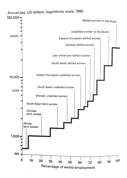
The graph was compiled by the World Bank in 1995, and was later published in a little and very useful book by Bob Sutcliffe titled ‘100 Ways of Seeing an Unequal World.’ Not sure, but I don’t think this graph has been updated.
Category: M Vernengo, Uncategorized
