A lot of the discussion on income inequality goes to show how much those at the top have gained, including some of the graphs I posted here, which tend to look at the top of the distribution. Below the mean income (in 2013 prices) of the lowest fifth of US households.
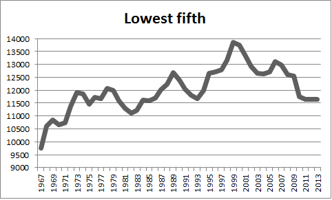 Note that the income of the lowest fifth increases in the late 1960s, and with the bubble-driven booms during Reagan/Bush-I and Clinton (but not Bush-II). But the growth is dismal. It goes from $9,755 in 1967 to $11,651 in 2013, or about 0.4 percent per year. And not at all since the Great Recession. The data is available here.
Category: Uncategorized